Branding for a Future
Wuhan Tourist Landmark
DATE
January, 2022
CATEGORY
Branding
DESIGNER
Celcea Tiffani, Jane Lu
CREATIVE DIRECTOR
Gergana Le Coq
CREDIT
Paper Stone Scissors
January, 2022
CATEGORY
Branding
DESIGNER
Celcea Tiffani, Jane Lu
CREATIVE DIRECTOR
Gergana Le Coq
CREDIT
Paper Stone Scissors
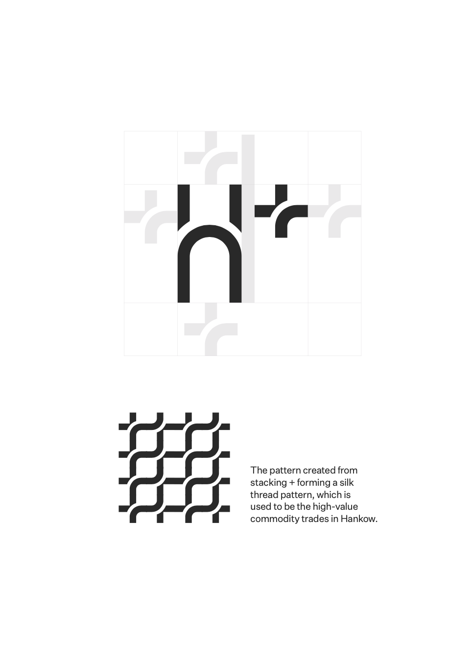
More than Hankow, it’s H+!
H+ is a future designated tourist landmark planned by the Wuhan city government. It represents the historical heritage of the city. Also showcases the new modern outlook the city has to offer.
The Wuhan government took the opportunity of the post-Covid domestic travel boom, aiming to rediscover this area of history, proceeding with caution and respect to its past, building the new landmark in Wuhan. Reclaiming and rebranding the port region Hankow as Hankow+, the program targets not only tourists but also local families. We were invited to design a brand system that works with the flexibility and variety of services the program is offering for visitors and residents, and also reflects the values of H+: hospitality, heritage, honor, home, happiness, and harmony.
Geography
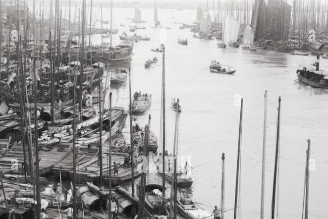
What makes Hankow special is its geographical location and rich history. Sitting right at the junction of the Han and Yangtze river from the middle 18th century to the 19th, Wuhan often appeared in the international press as a trading hub for teas and silk, making a significant impact on the western lifestyle.
Hankow historically was one of the main port cities in China that was early on exposed to modern goods, trades and culture. Its architecture took a lot of western influence mixed with Chinese traditional structure, and are mostly well-preserved and utilized
till today.
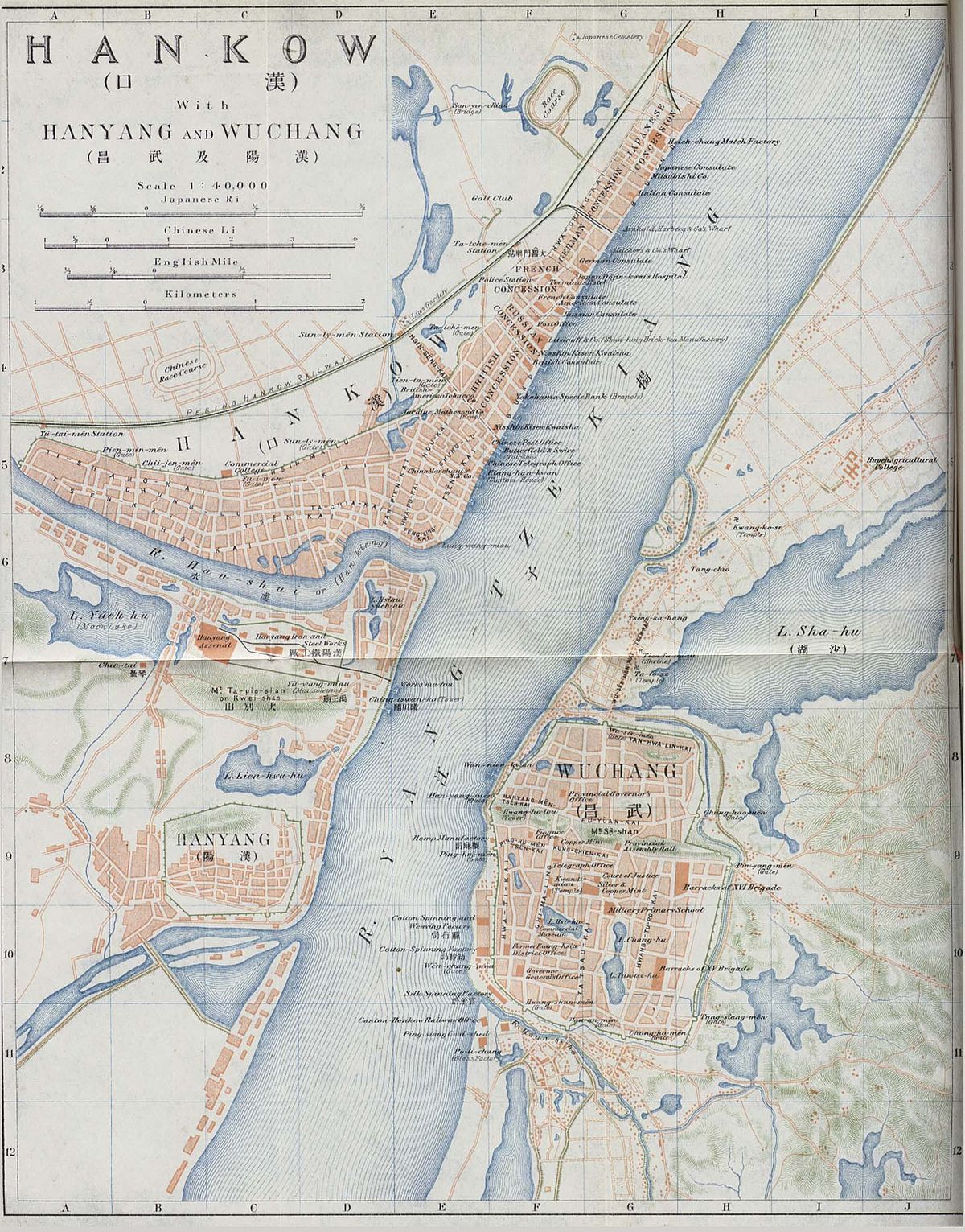
Vintage Map of Hankow Region
Background
POST COVID
ECONOMIC REVIVAL
After the 2020 Covid-19 outbreak, the Wuhan government desperately needs to bring back the economy and create more jobs locally. Transforming the life of necessary back to normal.
DOMESTIC TRAVEL BOOM
Since plummeting 33% in traveling revenue in 2020 during the pandemic, there have been observations on the boost of China’s travel domestically. (Thompson, Future 100, 2022) With traveling abroad not being an option, more people turn their vacation destination inward.
Since plummeting 33% in traveling revenue in 2020 during the pandemic, there have been observations on the boost of China’s travel domestically. (Thompson, Future 100, 2022) With traveling abroad not being an option, more people turn their vacation destination inward.
LOCAL LIFE IMPROVEMENT
Bringing in more international brands and highlighting some of its best local businesses, H+ is not only a travel attraction but most importantly built for locals to enjoy what city life has to offer.
Bringing in more international brands and highlighting some of its best local businesses, H+ is not only a travel attraction but most importantly built for locals to enjoy what city life has to offer.

CULTURAL IDENTITY
Instead of following the culture and trends from the West, the Chinese younger generation has been seeking a sense of cultural pride locally in recent years. More and more brands have been paying closer attention to cultural heritage & its modernization of it.
Instead of following the culture and trends from the West, the Chinese younger generation has been seeking a sense of cultural pride locally in recent years. More and more brands have been paying closer attention to cultural heritage & its modernization of it.
When building the Hankow H+ area, the sense of cultural pride is also aimed to show through the emphasis on the history and tradition of the region. Fix up the old historical buildings and incorporate them into modern city life, while making the history and stories of the area more visible to the public.
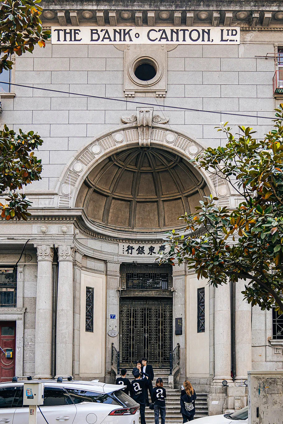


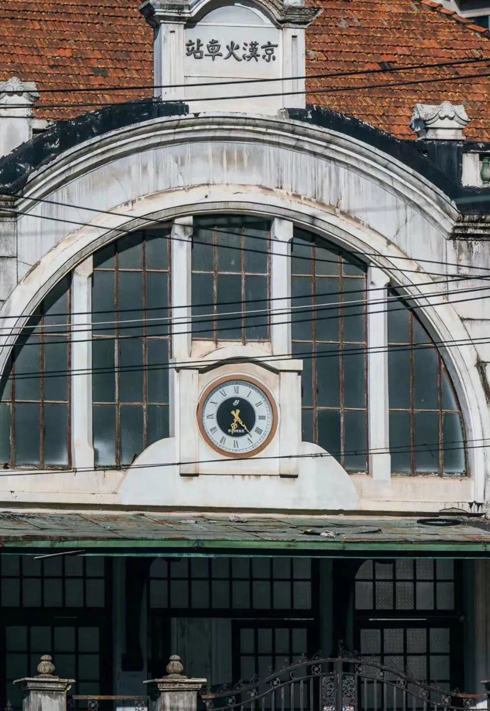


Architecture inspiration in Hankow Area
Design
The logo is hugely inspired by the rich architectural history of Hankow. In Chinese, Kow translates to “door; entrance” Hankow is warmly opening its door for everyone to enjoy history, discover interesting places, listen to stories, meet new people, have leisure time, and many more. Thus we took the shape of the door to incorporate it into the logo H+.
What also makes Hankow special is its geographical location and rich history. The logo is designed to showcase these two qualities in the most minimalistic and poetic way.


Brand Introduction Video
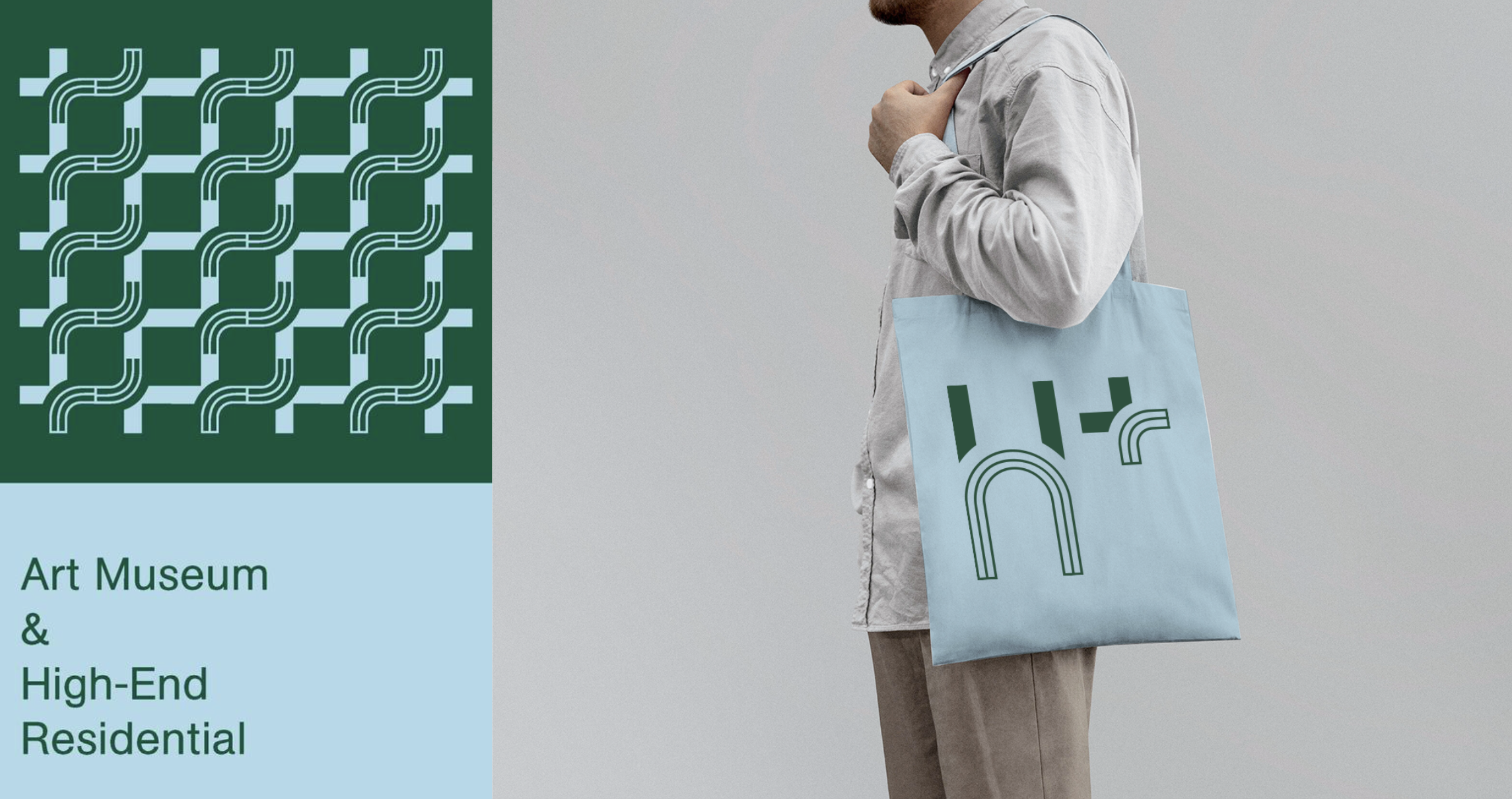
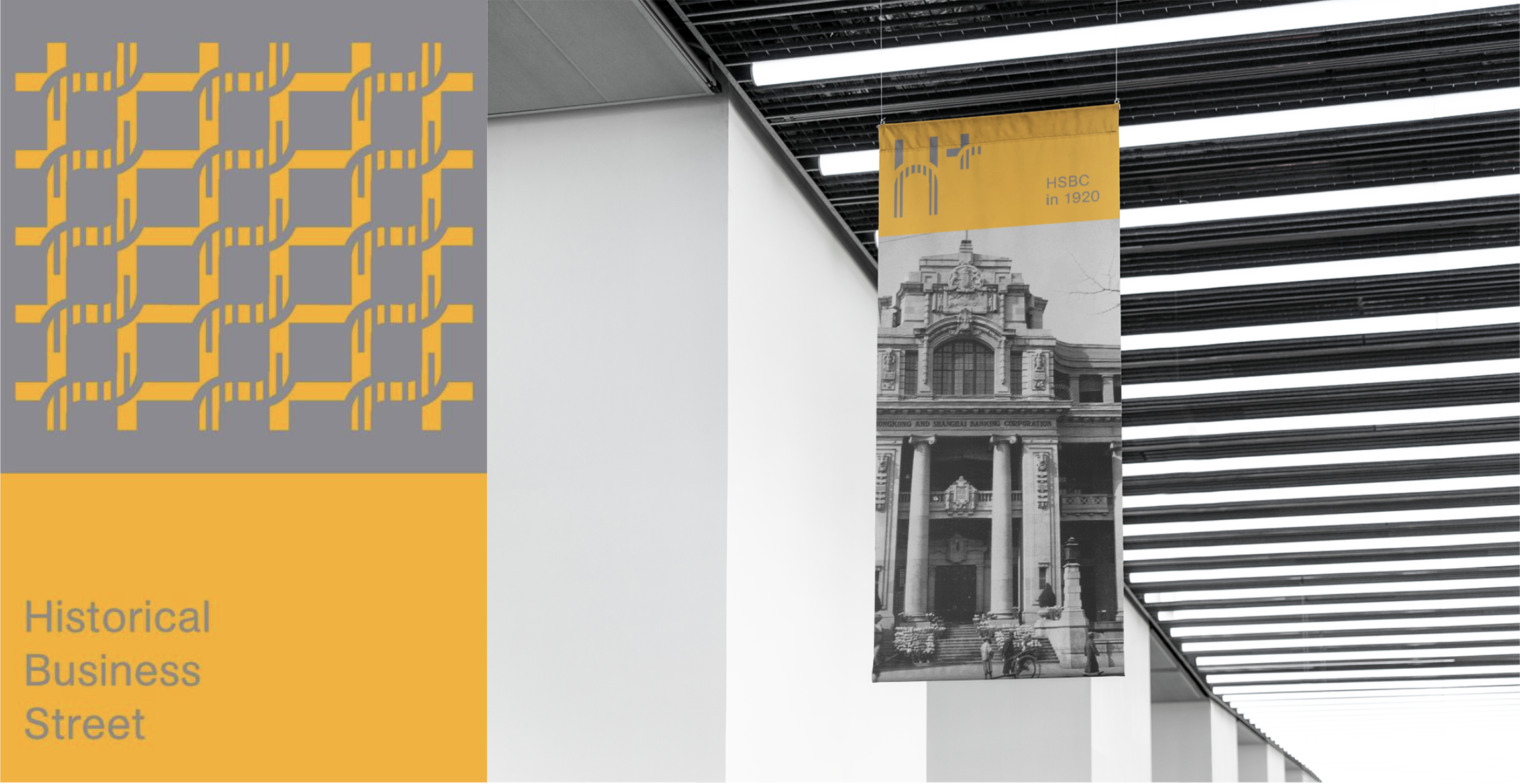
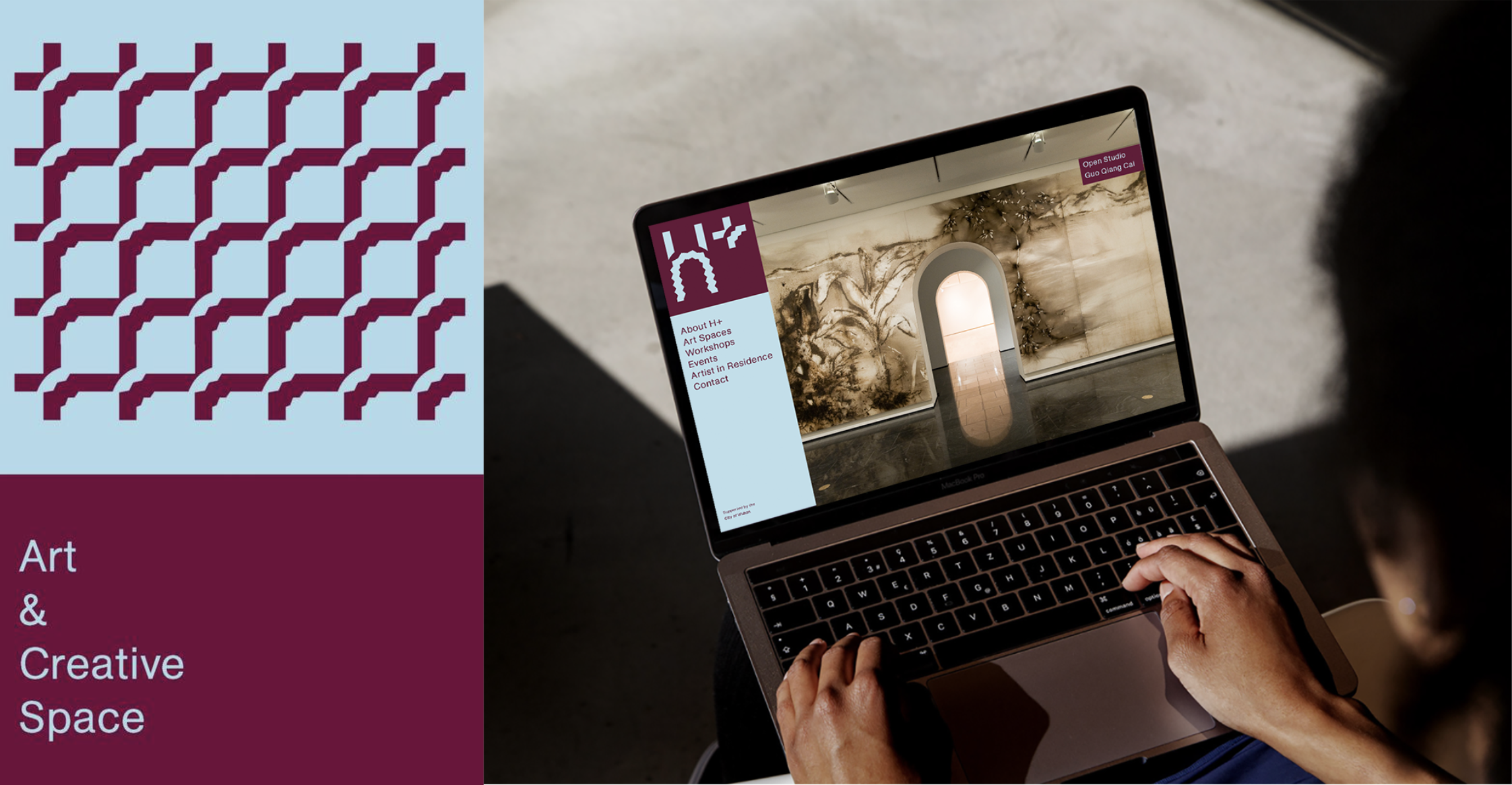
Brand Icons & Usages
H+ represents many groups and spirits that makes Hankow special. Diversity is important to be presented in a format of dynamic identity which aims to boost community self-esteem and economic growth with a strong tie to its historical background.
For the new H+ district, different areas are assigned for different usages. According to each area/district’s unique characteristics, we designed a set of icons for each area that are also variations from the original logo, keeping the brand consistent visually while showcasing diversity.
![]()
![]()
Brand Icons & Usages
H+ represents many groups and spirits that makes Hankow special. Diversity is important to be presented in a format of dynamic identity which aims to boost community self-esteem and economic growth with a strong tie to its historical background.
For the new H+ district, different areas are assigned for different usages. According to each area/district’s unique characteristics, we designed a set of icons for each area that are also variations from the original logo, keeping the brand consistent visually while showcasing diversity.